

Once you have the perfect photo printed, the next step, and sometimes the hardest, is finding the right frame. A good frame enhances a photo and turns it into a piece of artwork. Don't put yourself under too much pressure. Once you know the basics, the rest is a piece of cake.
Wooden picture frames
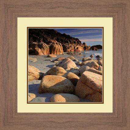
Wood is a natural material and gives a feature wall a warm, classic feel. It ranges from light to dark depending on the finish, which gives you plenty of options for complementing or contrasting with your image.
- Darker woods such as mahogany or walnut look fantastic with reds, browns and oranges.
- Lighter woods such as ash or pine work a treat with blues, greens and lavenders.
Think about the decor of the room, too. Wooden frames run from simple designs to ornate, intricate ones, and can suit a modern home or a rustic one. Match the frame to both the decor and the image and you shouldn't have much trouble.
Black or white picture frames
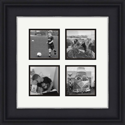
A solid black or white frame is a perfect way to bring out an image. Black leans formal and elegant. White leans casual. Either gives a modern, streamlined look.
Black frames highlight the darker features and contrasts in an image. They work best with images that have both light and dark tones, which keeps the whole piece balanced. White frames do something similar: they make the darks more prominent while the lighter hues blend into the background.
Many people put black-and-white images in these frames. It looks artistic and stylish, and matching frame colours are ideal for a gallery wall.
Metallic picture frames
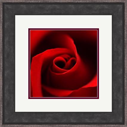
For a modern, trendy feel, go metallic. Metallic frames emphasise the colour in an image and make it more eye-catching. They often give a piece a classy feel, so they work very well for family portraits, landscapes and wedding photos. More candid shots may sit better in black, white or wood.
If your feature wall already has black and white frames, metallic ones complement them by adding a contrasting colour.
Five tips for choosing a frame
- Think tone, not exact colour. Don't concentrate on matching the frame to a colour in the photograph. Consider the overall tone of the image.
- Light for casual, dark for elegant. Choose a lighter frame for casual or simple art and a darker one for more elegant, prominent pieces.
- Match the room first. Fitting the frame to the room's decor matters more than matching the image too closely. Choose a frame that complements the decor or adds a spark of contrast.
- Contrast with the wall. To help the frame stand out, make sure it isn't too close in colour to the wall behind it.
- Keep mount and frame different. When they are too similar, the eye is drawn to the framing instead of the art.
Any good framers will show you a range of solutions and advise on what suits the work and where it will hang. We are on 01234 856 501 and sales@EasyFrame.co.uk, and we'll always chat even if you don't want to buy.