

By Paul Dunwell, writing for EasyFrame
© Copyright EasyFrame 2019
What this article is about
Earlier 'Frame Academy' pieces covered terminology, making a frame, gilding, choosing a type of frame and reusing old frames, all part of the dark art of picture-framing. In 'Frame Academy VI' we explain how to choose mat (mount) and moulding colours to suit the work being framed and the place where it will hang.
First principles
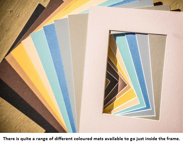
Choosing the right colour is part of doing justice to the artwork. It isn't easy, even with good colour sense, to identify the ideal mat for an artwork, photograph or other exhibit. Three principles help.
- Complement, don't upstage. The mat should not be the focus. It should no more draw the eye than a bridesmaid should outshine the bride.
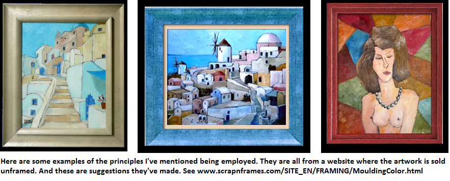
- Pick a colour from the work. Once you've ruled out colours that would overwhelm the subject, look at what's in the work, and especially its background. You may find a colour there that is available as a mat and would work as a liner to the frame: a blue from the sky, or a brown or green from the earth or foliage.
- Don't be driven by the surroundings. You don't want a combination that jars with the room, but don't give the room's colour scheme too much weight. You may do better with a neutral mat. Avoid anything too close in colour to the fixtures and fittings nearby.
The appliance of science
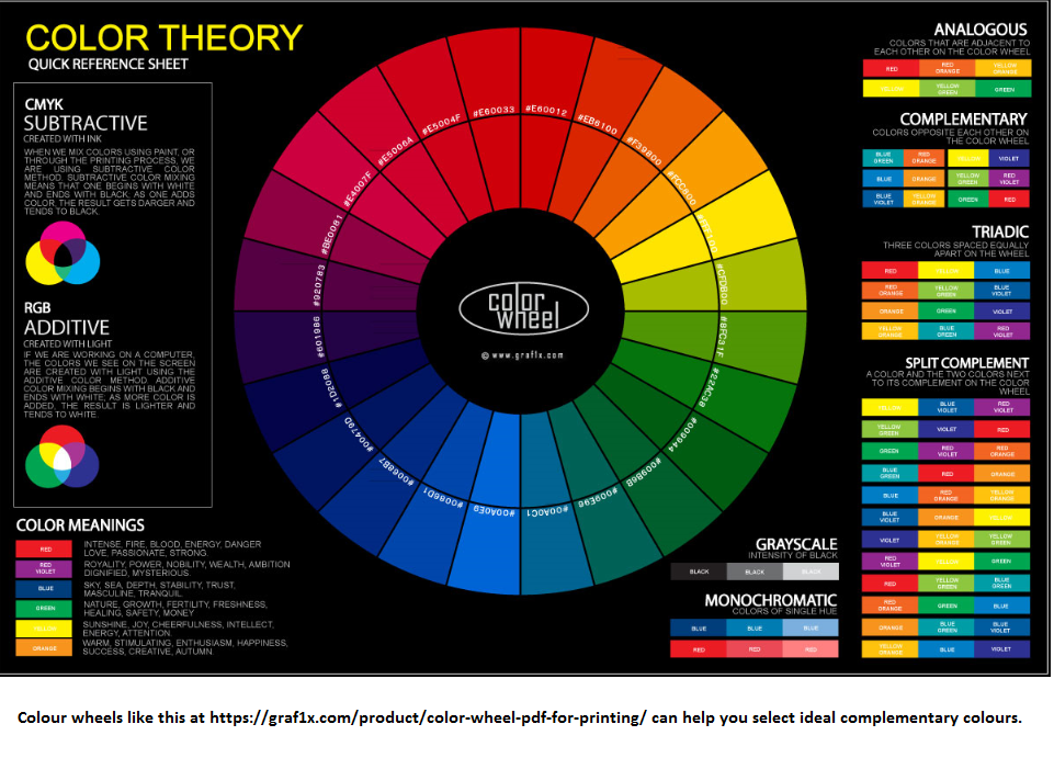
If you're stumped, look for a colour wheel. Colour wheels date from the late 19th century and help you find complementary colours. Professional designers of all kinds use them, and they work just as well for mat and moulding colours. There are lots of free examples online.
Using black and white
You don't have to use colour. White mats complement most décor. They're clean and neutral, so they don't distract the eye. Avoid snow-white, though, which is said to dazzle.
Many framers use white mats with a black core, which shows as a band directly outside the artwork. It creates a useful threshold and sharpens the contrast, setting off both the colours of the artwork and the plainness of the mat. You could use a grey instead.
Tints and tones
Specialists use terms such as 'colour value', 'tints', 'shades' and 'tones'. Simply put, a colour's 'value' is where it falls between black and white. 'Tints' are nearer to white, 'shades' are nearer to black, and anything in between is a 'tone'.

Colours are also warm or cold. Think of orange, the colour of flames, and blue, associated with ice floes.
And what of frame colours?
Darker frames are said to help the eye appreciate whatever appears distant in the artwork. Lighter frames are said to make objects in the foreground seem more prominent.
Try it with technology
Websites now let you see how you'd look in a dress or with a new hairdo. So far I've not seen one that lets you try mat and frame colours beside your own artwork, but you can easily do it yourself. Photograph your artwork, load it into Microsoft Paint or similar, and draw a few virtual frames in likely colours.
Where to find out more
There are lots of sources of information on mat and frame colours. One I recommend is www.carteravenueframeshop.com/framing-info/framing-design/how-to-choose-mat-colors/. It is a North American business, so you can pick their brains but they're not well placed to serve you. Another is the Artists Network site at www.artistsnetwork.com/art-techniques/how-to-choose-the-best-frame-to-present-and-protect-your-artwork/.
Conclusion
Getting mat and frame colours right is important, not least because you, or somebody else, may have to live with your choices. There is no point in great work that's poorly framed.
If you are framing something precious, it's always worth going straight to a professional framer like EasyFrame for advice. They can do the whole job or help with the part that has left you jittery, and can supply much of what you need to do it yourself.