

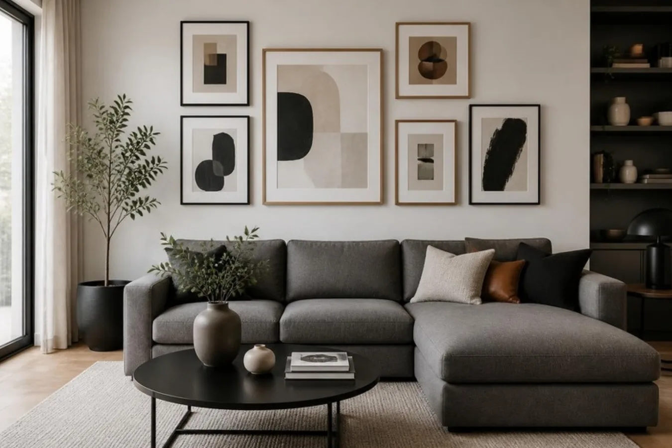
If you're redecorating and want to be on trend, these were the styles coming through in interior design in 2014, and how frames can pick them up.
Blue is the colour
Everyone says blues are in this year, from cobalt and royal blue to turquoise at the greener end. Powder and baby blues are less popular, but some subtler shades are appearing too.
Blue picture frames add a colourful accent against lighter shades, and bright accent colours are also in. Don't go overboard. Too much dark blue can make you feel blue, and too much light blue can make a room feel cold without warmer colours around it.
Keep it simple
Simplicity has become popular in web and print design, marketing and fashion, where the most information has to be presented in the quickest way. A simple look at home shows that you can make an impact without going all-out. Fewer colours and textures, with a few subtle details, look just as good and avoid a clash of too many ideas.
Full of brass
If there is a metal of the season, it is brass. The trend probably ties in with vintage decor, which has been around for a while and shows no sign of going away.
Bronze picture frames give an antique look, and they don't need to be real metal: wooden frames with a metallic finish look brilliant too. Bronze is classy but a little rough around the edges. It is a warm metallic, so it avoids the cold, minimal look that some lighter metals give a room.
Light and natural woods
Lighter, more natural woods are making a comeback in furniture and fixtures, in place of darker or more colourful finishes. That's good news if you have art to frame, because natural-looking wood suits many looks, particularly a rustic or minimal one.