

By Paul Dunwell, writing for EasyFrame
© Copyright EasyFrame 2018
What this article is about
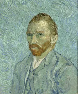
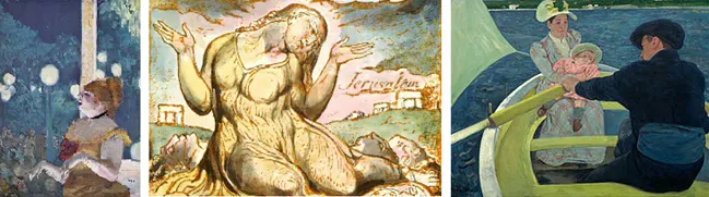
This article isn't about Van Gogh, because it seems he wasn't colour-blind. It is about other notable artists who were: such luminaries as Monet, Turner, Méryon, Degas, Cassat, Pugh and Blake.
Two of those seven are profiled in rather excellent framing articles on this site, 'Turner Corner' and 'Blake's Heaven', at www.easyframe.co.uk/NewsArticle/turner-corner and www.easyframe.co.uk/NewsArticle/blakes-heaven.
What this article does is explain the advantages of colour-blindness and ask the question you must be pondering: why would a seemingly disproportionate number of colour-blind men be recognised as great artists by audiences who, for the most part, should be able to spot something amiss with the hues, shades, tints and tones?
Just what is colour-blindness?
If you're colour-blind, you're one of the 8% of men or 0.5% of women who are affected. I say this not as an ophthalmologist but as somebody for whom 'colour vision deficiency' is an understatement, and who knows it has advantages.
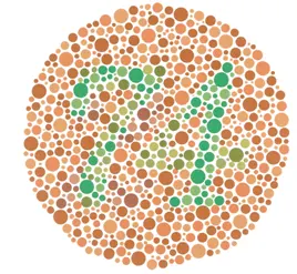
We tend to think of red-green colour-blindness (deuteranopia) because it is the most common form. Some people have a blue-yellow problem (tritanopia; imagine being attacked by wasps coming out of a blue sky). A tiny minority have no colour vision at all (achromatopsia). Whatever the variety, the problem is duff cones. The rods are fine.
The cause is usually hereditary. The gene is on the X chromosome, of which men have one and women two, which is why so few women are affected. It is inherited from the grandfather and passed through his daughter to her sons in 50% of cases. But it can also result from shaken baby syndrome, accidents or trauma to the eye or brain, diabetes, vitamin A deficiency, solvent abuse, or drugs used to treat TB and malaria. Colour vision deteriorates with age anyway because of macular degeneration, though it usually improves if you have new lenses fitted.
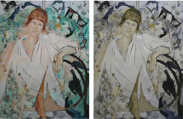
What's it like to be colour-blind?
Odd. For anyone who cannot imagine it, here are a few examples I've noted, though we seem to be affected in slightly different ways:
- Groups of colours are easily confused. Purple and blue. Light green, pink and grey. Green and brown. Some reds and some greens.
- That can be dangerous. In around 1980 I was given a very old washing machine with a red, green and brown power cable. Those colours are indistinguishable to me. My attempt to fix it left the casing live and humming, and gave me a shock good enough to hurl me across the kitchen.
- Modern devices pose problems too. One of my first mobile phones had a charger that was (if memory serves) red, orange and green in different modes. To me the colour never changed.
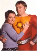
- We make assumptions. Grass is green, surely? So if it turns brown, many of us won't notice. I once watched an episode of 'My Hero' in which the alien literally turned green with envy. Only when he asked 'Is everyone laughing because I'm green?' did I realise he wasn't pink. He still looked pink to me.
- Proximity changes everything. Most people spot bright red rose hips among greenery from a distance. People like me cannot. But once we get close enough to resolve the outline of each fruit, the difference in colour becomes so blindingly obvious that it seems odd we didn't notice before.
- Light is different from flat colour. Green traffic lights can be confused with white lights, and red and amber ones with yellow sodium street lights. Light is made of red, blue and green, which together make white. The three basic colours in paint are red, blue and yellow, and mixed with only a little yellow they make something close to black.
- There are advantages. Colour-blind people are better at seeing through camouflage, so we're useful in military intelligence roles that involve examining aerial photography. We are also said to have better night vision. (Not in my case, but that may be coincidental.)
Coping mechanisms
Most colour-blind people adopt coping mechanisms. One is knowing that the red light is always at the top of a traffic light and the green at the bottom, so the one in the middle is amber. Simples! Since traffic lights can 'disappear' among other lights, it makes sense to look for lights on big sticks at junctions. This falls over when driving overseas, where traffic lights are strung up on wires.
Artists have their own strategies. Charles Méryon, the 19th-century French artist, simply avoided colour.
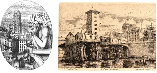
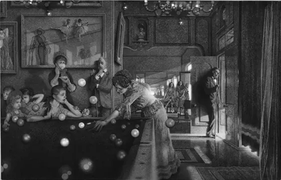
Many artists have stuck to etching, or become sculptors: anything to avoid colour. The American painter Peter Milton was unaware for years, as a painter and even a lecturer, that he was botching the colours. When he realised, he did away with the lot and went monochrome. There is a super article on that at www.npr.org/2014/11/16/364092778/for-one-artist-colorblindness-opened-up-a-world-of-black-and-white't=1541684018402 and, below, an example of his work. Yes, it's all in black and white.
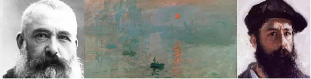
Not all great artists have avoided colour. JMW Turner's 'The Fighting Temeraire', voted 'The Greatest Painting in Britain', is a blaze of colour that presumably approximated to what Turner saw. (In all fairness, the vessel's masts and rigging had been removed by the time of the journey he was supposedly documenting, it was pulled by two tugs not one, and the sun should have been in front of it not behind. But let's not split hairs.) Monet was the same.
You could brand these people 'impressionists' because, for most onlookers, what ends up on the canvas is not an accurate depiction of what they see. Yet there is a suspicion that the artist is seeing more than the audience sees, not less. That perceptual gap is enough to provoke genuine envy.
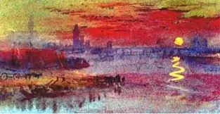
Famous or not, colour-blind artists can resort to obvious coping strategies, including asking a woman. This comes in handy when paints are not clearly labelled, especially when they're being mixed on the palette. My brother (see below) used to ask our mum.
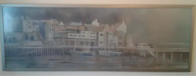
I should add that I won a design competition with 1,800 entries simply by limiting my colours. I could tell black, white, maroon and silver apart with some confidence, so I stuck with those. And I got A level Art by drawing. So if colour-blindness has put you off art, take heart and give it a go. You may not be a great artist, but colour-blindness shouldn't limit what you produce. Nor, when you're buying or hanging art, should it stop you choosing work by colour-blind artists.
And Van Gogh?
According to the Van Gogh Museum, whose staff ought to know, the latest theory is that he wasn't colour-blind but that his reds have faded more than other colours over the years. His work also shows knowledge of the colour theories of his day, which he could never have applied had he been colour-blind. Read about it at www.vangoghmuseum.nl/en/125-questions/questions-and-answers/question-52-of-125
Conclusion
Who cares if these guys (and Ms Cassat; remember that 1 in 17 people with colour-blindness is female) were colour-blind? They were great, and their work would enhance any home, public building or office.
You'll need it framing first. EasyFrame is an obvious and affordable supplier, whether you want everything you'd need to do the job yourself or would rather they did it for you. Any good framer will show you a range of solutions and advise on what suits the work and where it will hang.
EasyFrame is on 01234 856 501 and sales@easyframe.co.uk, and they'll always chat even if you don't want to buy!